Wilson Property

Scope :
Brand design

Client :
Wilson Property

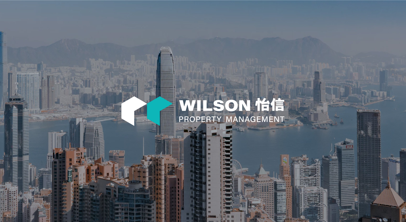
WILSON is a property management company based in Hong Kong that provides comprehensive, high-quality management services for a wide range of properties, including residential, industrial and commercial buildings, shopping malls, and government agencies.

The logo is combined with two boxes which represent the upper parts of two skyscrapers, and the letter ‘W’ for Wilson.


The box shapes can be extended with different variations and built up into a graphic pattern as a brand identity